Graphic Design
Nine projects across Illustrator, InDesign, and Photoshop, each one a different way of thinking about a visual problem, from illustration and typography to branding, editorial layout, and motion.
Learning to trust instinct.
I signed up for an introductory graphic design course wanting to explore a side of creativity I had not had much chance to pursue. I have always been drawn to the intersection of technology and design, and this felt like the right place to learn the tools behind it. After spending most of college thinking in code, data, and systems, I wanted a space where there was not always one right answer.
It pushed me to slow down, sketch, experiment, and trust my own instincts. Along the way I learned Illustrator, InDesign, and Photoshop, and more than anything, I rediscovered how much I enjoy making things simply because they are interesting.
Robot Companion
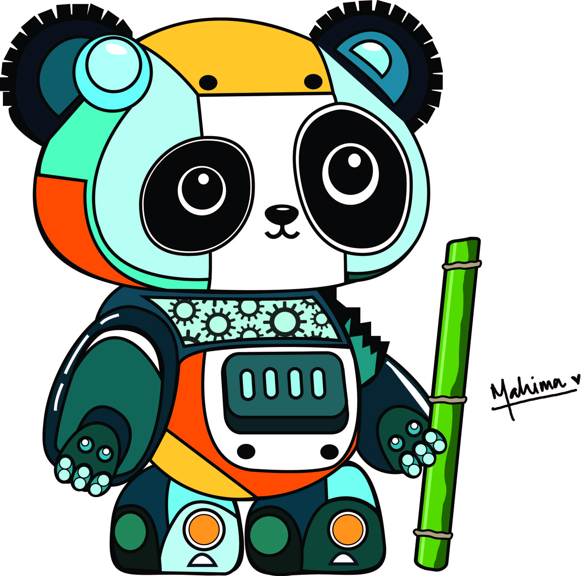
Pandas have always been one of my favorite animals, so I turned the robot prompt into something a little more playful. I sketched and experimented for a while before landing on a design that balanced mechanical detail with personality.
As one of my first Illustrator projects, it taught me Bezier curves, shape building, the pathfinder tool, layers, and color palettes. Equal parts technical challenge and creative fun, it is still one of my favorite pieces to come out of this course.
TEAM
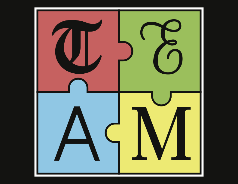
I chose the word TEAM because it lent itself naturally to visual storytelling: puzzle pieces, different letterforms, and varying styles, all reinforcing the idea of people coming together.
Recreating each letter by hand gave me a new appreciation for typography, from building smooth vector paths and minimizing anchor points to thinking carefully about spacing, proportion, and balance. It is one of those projects that changed how I notice type in everyday life.
Dreamscape
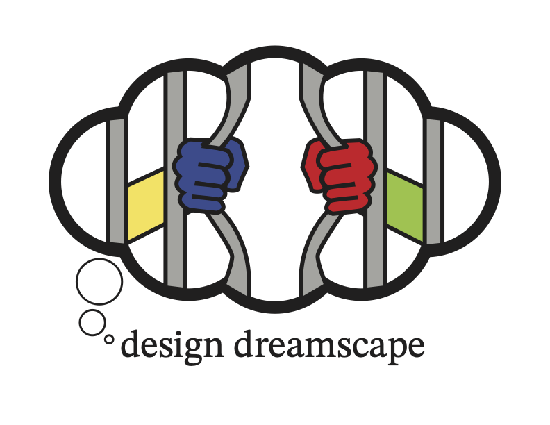
For this project I designed a visual identity for the design course itself. I imagined Dreamscape as a place where ideas could be explored freely and creativity felt limitless.
Designing a logo taught me that branding is about more than making something look interesting. In critique, feedback pointed out that Dreamscape could easily read as landscape, making the concept less immediately clear. That note has stayed with me since.
Good branding should spark curiosity without creating confusion.
On the Dreamscape critiqueMumbai, Explained
I could not pass up the chance to tell people about my hometown. Most of my classmates had probably never been to Mumbai, so I wanted to capture what makes it such a unique place.
Illustrator was the biggest challenge here: nothing was ready to drag and drop, so every icon, layout, chart, and illustration had to be built and refined from scratch. It gave me a much deeper appreciation for the craft behind something that looks simple.
Exploring UMMA

Compared to some of the other projects, this one felt surprisingly natural. I have always enjoyed designing documents and presentations, so learning InDesign felt like an extension of something I already liked doing, just with much more control.
Working with grids, paragraph styles, typography, and multi-page layouts showed me how thoughtful structure can quietly guide someone's reading experience. It was a nice reminder that good design is often the part people don't notice.
Shell of a Person
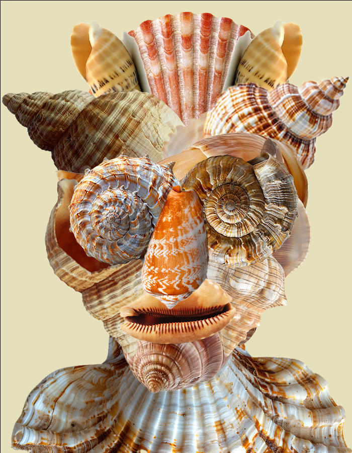
This was the steepest learning curve of the whole course and one of my favorite projects overall. I spent days feeling completely stuck before the idea finally came together: a portrait assembled entirely from seashells, inspired by one of my best friend's photos because the pose had exactly the composition I wanted.
Once I had a direction, I learned an incredible amount about Photoshop, from masking and compositing to adjustment layers, color correction, and blending images together seamlessly. More than anything though, it taught me to trust the creative process. Sometimes the hardest part isn't making the artwork, it's finding the idea worth making.
See Level

Long before I built websites with HTML and CSS, I was designing them in Photoshop. We were asked to create the homepage for a fictional travel company, balancing navigation, imagery, typography, and content hierarchy for a scrolling landing page.
It was my first time thinking about interfaces from a user's perspective rather than just arranging things to look nice. Looking back, I can see how this project quietly introduced me to many of the ideas that eventually led me toward product and web design.
A Light Home
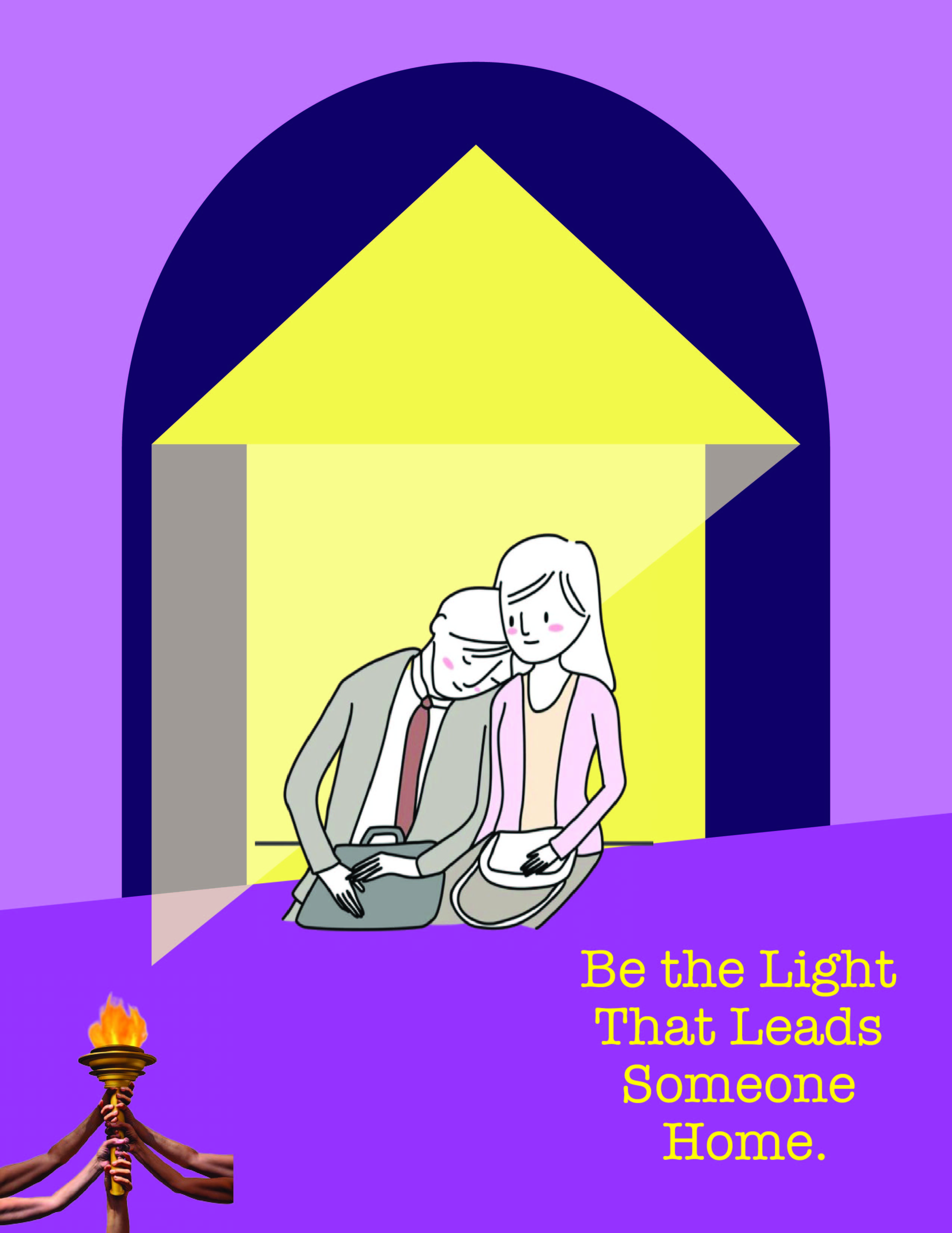
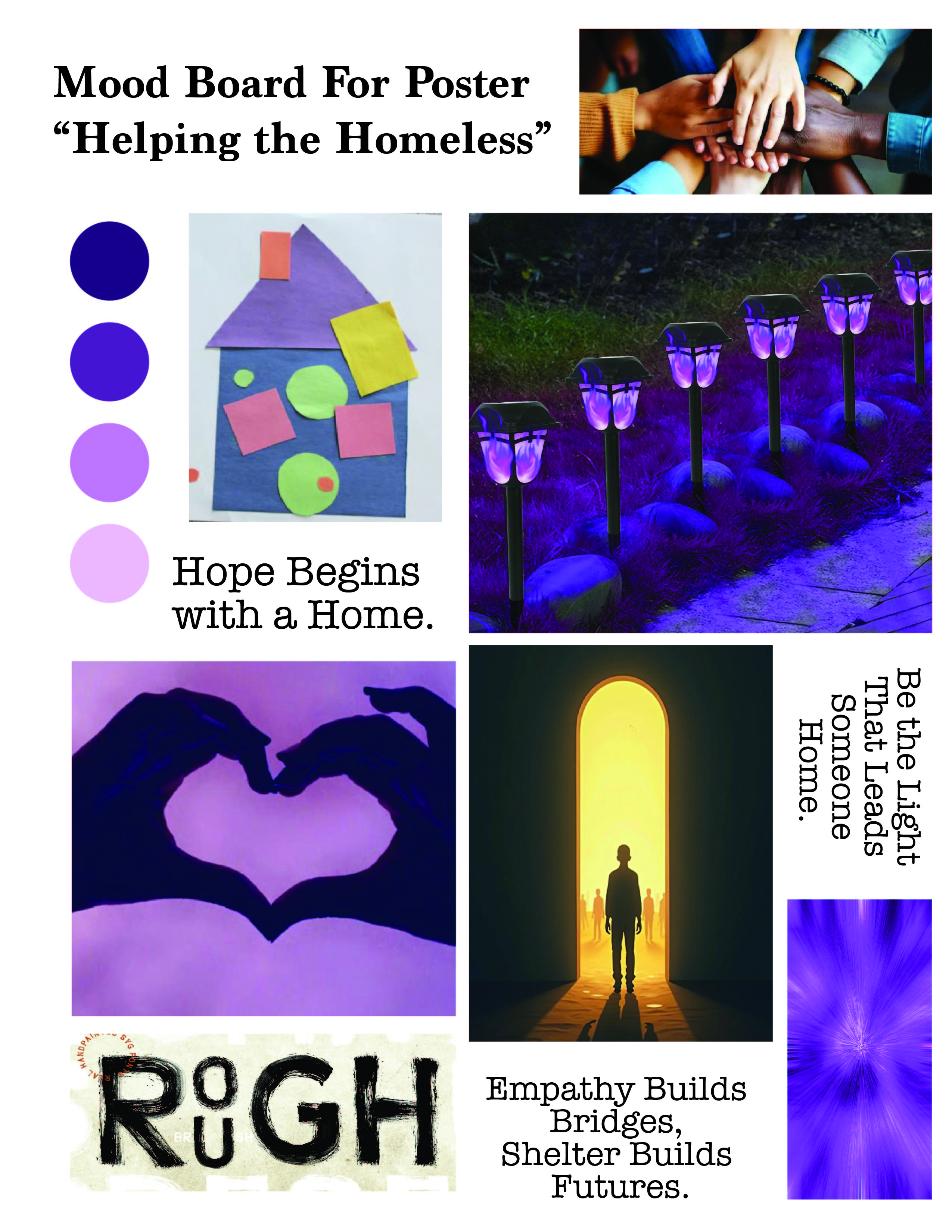
Final poster, and the mood board that shaped it
Designing for a social cause required a different way of thinking. Before creating the final poster, we built mood boards and explored multiple concepts, which was something I had never really done before.
The biggest challenge wasn't using Illustrator. It was deciding what story I wanted the design to tell. Throughout the process I learned that visual choices, from imagery to composition, shape how people interpret a message just as much as the words themselves.
Twenty-Four Frames

This quickly became one of my favorite projects because it gave me an excuse to pick up my iPad and draw again after a long time. I created a looping animation about an alien, a UFO, and an unsuspecting person walking by, drawing every frame individually before assembling everything in Photoshop.
Beyond learning timeline animation and frame sequencing, it reminded me how rewarding it feels to slow down and create something entirely by hand. It's probably the project that best captures why I wanted to take this course in the first place: to practice creativity for the sake of creativity.