ICU Mortality Prediction
A classical machine learning pipeline that turns messy, irregularly sampled ICU records into calibrated mortality predictions, built end to end, from raw timestamped measurements to a bootstrapped evaluation and a held-out challenge submission.
Real patient data, not a clean CSV.
Every patient in this dataset arrives as a raw, timestamped log of everything measured during their first 48 hours in the ICU: heart rate, temperature, lab values, and dozens more, recorded at irregular intervals, with missing entries and repeated readings scattered throughout. None of that can go straight into a classifier.
The real work of this project was turning 12,000 of these irregular, patient-specific histories into a single comparable feature matrix, then building, tuning, and honestly evaluating models that could predict who would survive their hospital stay based only on those first 48 hours.
From a timestamped log to a feature vector.
Each patient's raw file is a table of three columns: a timestamp, a variable name, and a value. Some variables, like age and height, are recorded once at admission. Others, like heart rate, might be measured once, many times, or not at all over the full 48 hours. Unknown observations are explicitly encoded as -1, which first had to be converted to a proper missing value before anything else could happen.
For static, time-invariant variables, I kept the raw value as its own feature. For every time-varying variable, I summarized the entire 48-hour window with a single number: its maximum observed value. A patient's heart rate readings of 73, 81, 77, and 91 collapse into one feature, max_HR = 91. If a variable was never measured for a patient, that feature stayed undefined rather than being guessed at this stage.
HR: [73, 81, 77, 91] → max_HR = 91
Creatinine: [0.8, 1.0, 1.5, 2.1] → max_Creatinine = 2.1
RespRate: [] (never measured) → max_RespRate = NaN
static_variables = config["static"]
timeseries_variables = config["timeseries"]
# replace unknown observations (-1) with a real missing value
df_replaced = df.replace(-1, np.nan)
static, timeseries = df_replaced.iloc[0:5], df_replaced.iloc[5:]
feature_dict = {}
for idx, row in static.iterrows():
feature_dict[row['Variable']] = row['Value']
# every time-varying variable collapses to its max over 48 hours
for variable in timeseries['Variable'].unique():
if not isinstance(variable, str):
continue
vals = timeseries[timeseries['Variable'] == variable]['Value']
feature_dict["max_" + variable] = vals.max()
return feature_dict
One number can hide unintended meaning
A categorical variable like ICU type was originally represented as a single number, which quietly implies an ordering that isn't real. A linear model would treat "ICU type 4" as if it were four times "ICU type 1," a relationship with no clinical meaning. Representing it as a set of binary indicators instead removes that false ordinal assumption.
Max is a simple summary, with limits
Reducing a whole 48-hour trajectory to its maximum is easy to compute and clinically intuitive, since spikes often matter. But it throws away everything about how a variable trended, and it's sensitive to a single noisy or erroneous reading. Mean, variance, and slope over time are all summary statistics that could add signal a single max misses.
Filling gaps, and putting features on the same scale.
With a feature matrix in hand, two problems remained: missing values, since not every variable is measured for every patient, and wildly different scales, since a lab value and a heart rate live on completely different numeric ranges. I built each stage as a standalone, reusable function before touching any model.
Mean imputation
Each feature column was imputed independently, replacing missing values with the mean of that column's observed values across the population. This assumes values are missing more or less at random, and that a typical value won't badly distort a patient's overall picture, an assumption worth naming rather than hiding.
Min-max normalization
Every feature was rescaled to sit between 0 and 1. Without this step, regularization penalizes features on larger numeric scales far less than features on smaller ones, which quietly biases the model toward whichever variables happen to have bigger raw ranges rather than whichever are actually more predictive.
Stratified 5-fold cross-validation
Hyperparameters were selected using 5-fold CV that preserves the ratio of positive to negative labels in every fold. With an imbalanced outcome, an unstratified split could easily leave a fold with almost no positive cases, making its validation score unreliable.
Bootstrapping for uncertainty
Rather than reporting one test score, I resampled the test set with replacement 1,000 times, recomputing each metric each time, to get a distribution of plausible performance rather than a single lucky or unlucky number.
for col in range(X.shape[1]):
mean_val = np.nanmean(X[:, col])
missing = np.isnan(X[:, col])
X[missing, col] = mean_val
return X
def normalize_feature_matrix(X: npt.NDArray) -> npt.NDArray:
# rescale every column to [0, 1] with respect to the population
scaler = MinMaxScaler()
return scaler.fit_transform(X)
Linear models, tuned honestly.
I compared regularized logistic regression against kernel ridge regression, sweeping both the regularization strength and the regularization type across a grid, using cross-validation performance rather than training performance to pick a winner for each metric.
# z(θ) is the regularization penalty (L1 or L2)
# C controls how much the loss is allowed to dominate the penalty
best_C, best_penalty = None, None
for penalty in penalties:
for C in C_range:
clf = LogisticRegression(penalty=penalty, C=C, solver='liblinear',
fit_intercept=False, random_state=seed)
mean_perf, _, _ = cv_performance(clf, X, y, metric=metric, k=k)
if mean_perf > best_performance:
best_performance = mean_perf
best_C, best_penalty = C, penalty
Sweeping every metric against a grid of C values in powers of ten, for both ℓ1 and ℓ2 penalties, surfaced a different winning configuration for almost every metric:
| Metric | C | Penalty | Mean (Min, Max) CV |
|---|---|---|---|
| Accuracy | 0.001 | L1 | 0.8600 (0.8594, 0.8625) |
| Precision | 1 | L2 | 0.6024 (0.1667, 1.0000) |
| F1-score | 10 | L2 | 0.2265 (0.1587, 0.2642) |
| AUROC | 1 | L2 | 0.7804 (0.7539, 0.8192) |
| Average Precision | 1 | L2 | 0.3923 (0.2893, 0.4965) |
| Sensitivity | 10 | L1 | 0.1474 (0.1111, 0.1778) |
| Specificity | 0.001 | L1 | 1.0000 (1.0000, 1.0000) |
5-fold cross-validation performance on the training set. I optimized for AUROC when training the final model, since it stays informative under class imbalance without depending on a fixed decision threshold.
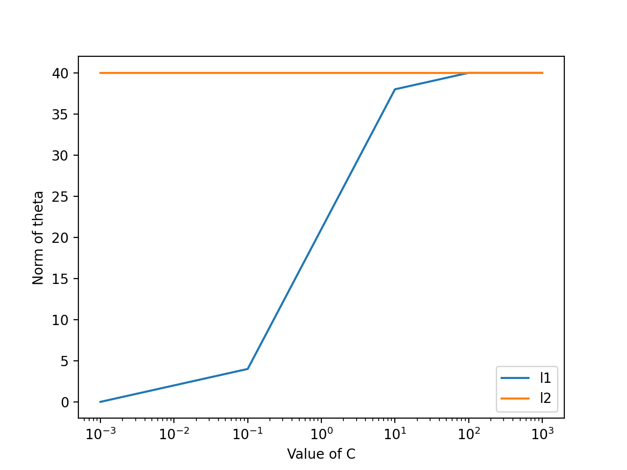
Number of non-zero coefficients (the ℓ0-norm of θ) as C increases, for L1 versus L2 regularization
What C actually controls
A small C means heavy regularization: the model keeps its weights close to zero and stays simple. A large C shifts the balance toward fitting the training data closely, which can improve training fit but risks overfitting to noise the model hasn't actually seen generalize.
L1 finds sparsity, L2 doesn't
The plot above shows it directly: with L1 regularization, the number of non-zero coefficients starts near zero and grows as C increases, meaning L1 actively performs feature selection at low C. L2 keeps nearly every coefficient non-zero regardless of C, shrinking weights toward zero without ever fully eliminating them.
Kernel ridge, for non-linear structure
Alongside logistic regression, I trained kernel ridge regression with a linear kernel, which behaves almost identically to plain regularized regression, and with an RBF kernel K(u, v) = exp(-γ‖u-v‖²), which implicitly maps features into a higher-dimensional space to capture relationships a straight line can't.
Reading the coefficients
Training an ℓ1-regularized model at C = 1.0 and reading off its largest weights turns the abstract idea of "feature importance" into something concrete. A more positive coefficient pushes predicted mortality risk up as that feature increases. A more negative one is protective. A coefficient of exactly zero means L1 decided that feature didn't earn a place in the model at all.
| Positive Coefficient | Weight | Negative Coefficient | Weight |
|---|---|---|---|
| max_Bilirubin | 4.1050 | max_GCS | −2.7038 |
| max_BUN | 2.5935 | max_Urine | −2.0178 |
| max_HR | 1.6194 | max_SaO2 | −0.9228 |
| Age | 1.5562 | max_HCO3 | −0.8587 |
Highest-magnitude coefficients from the ℓ1-regularized logistic regression at C = 1.0. Elevated bilirubin, BUN, and heart rate push risk up; a higher Glasgow Coma Scale score and stronger urine output are protective, exactly matching clinical intuition.
How much does γ actually matter?
For the RBF kernel, γ controls how local the similarity function is. I fixed C = 1.0 and swept γ across six orders of magnitude, watching cross-validated AUROC rise, peak, then fall as the kernel went from too smooth to too sharp.
| γ | Mean (Min, Max) CV AUROC |
|---|---|
| 0.001 | 0.7467 (0.6949, 0.8029) |
| 0.1 | 0.7915 (0.7589, 0.8248) |
| 1.0 | 0.7675 (0.7253, 0.7854) |
| 10 | 0.7485 (0.7194, 0.7840) |
| 100 | 0.7164 (0.6744, 0.7605) |
A γ that is too small behaves like a linear model and underfits. Too large, and the kernel memorizes individual training points and stops generalizing. The best test performance, at C = 1 and γ = 0.1, reached 0.8700 accuracy and 0.7842 AUROC, edging out the linear logistic model on accuracy and specificity while landing at a comparable AUROC. Unlike a linear model, though, there's no single weight vector to read back out. An RBF kernel operates entirely through pairwise similarities to the training points, so there's no per-feature coefficient left to interpret.
Two ways to draw the same line.
Before scaling up to the full feature matrix, I compared logistic regression against least-squares regression used as a classifier, on a small 1D toy dataset. Both approaches ultimately produce a single decision boundary, but they get there very differently: one models a probability with a sigmoid, the other fits a straight line and thresholds it at 0.5.
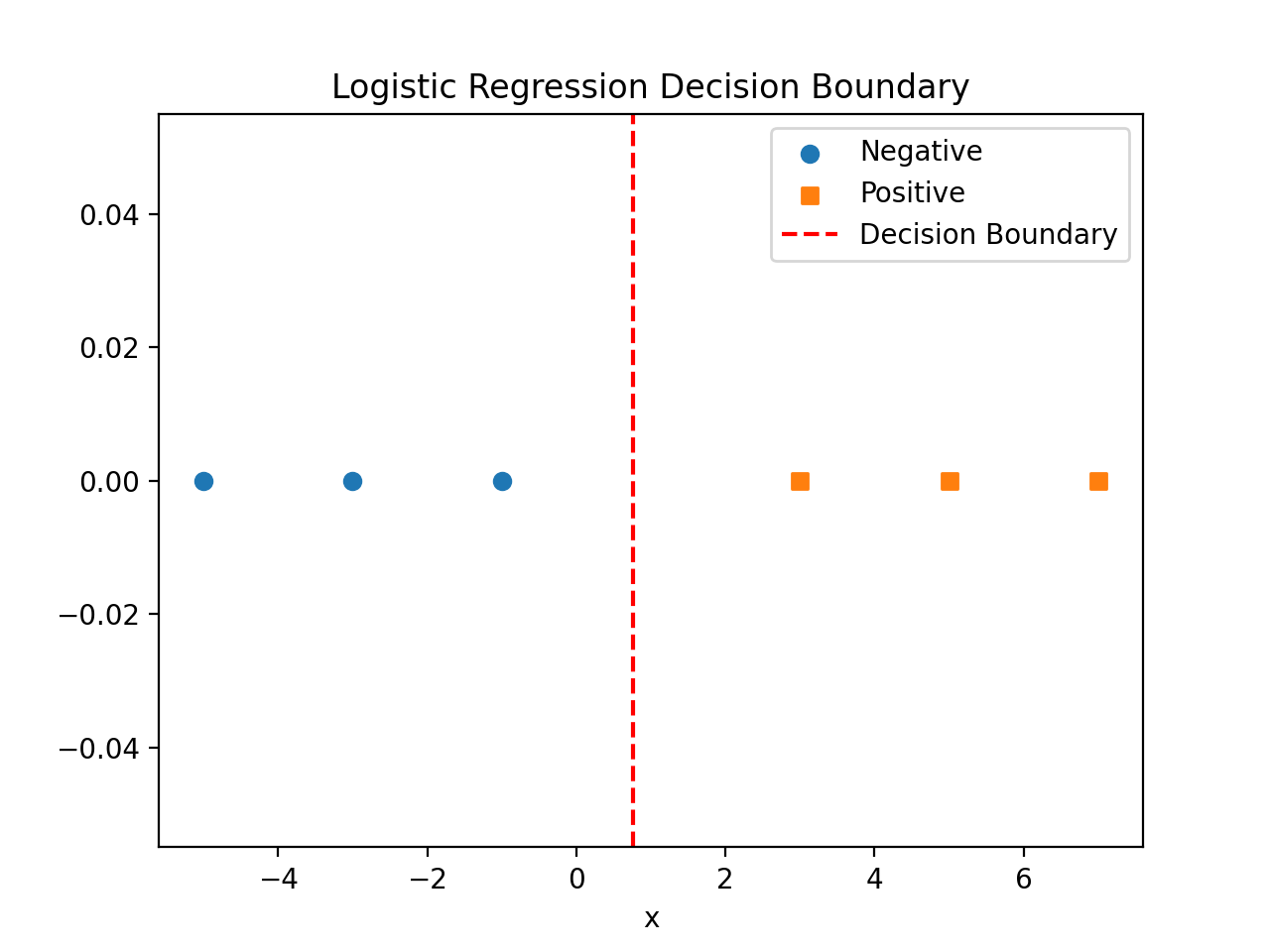
Logistic regression's sigmoid-based decision boundary
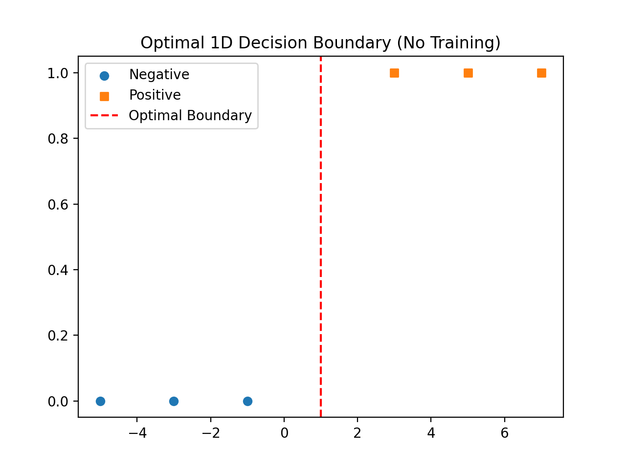
The optimal boundary for this toy set, with no training required
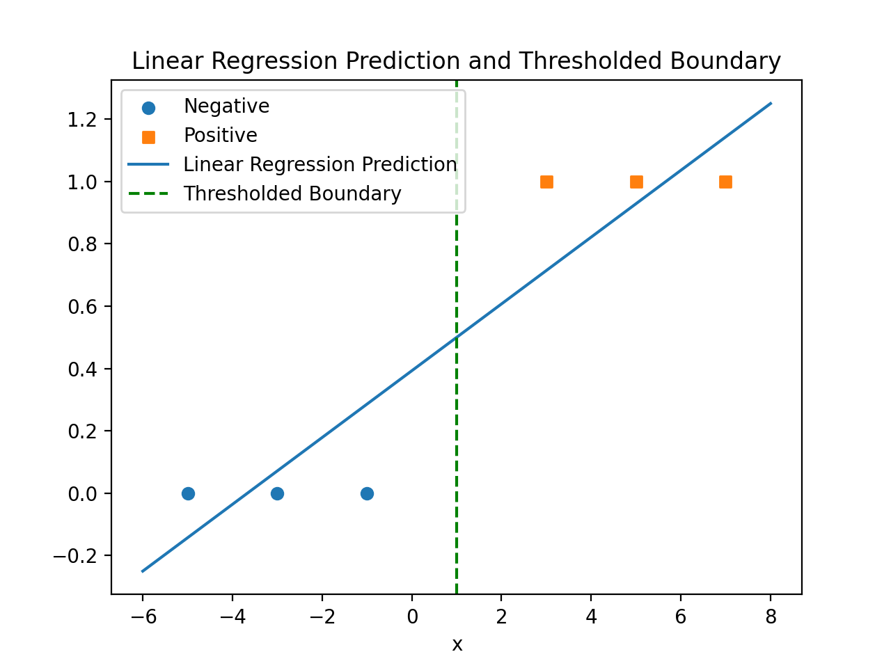
Linear regression's continuous prediction, thresholded at y = 0.5
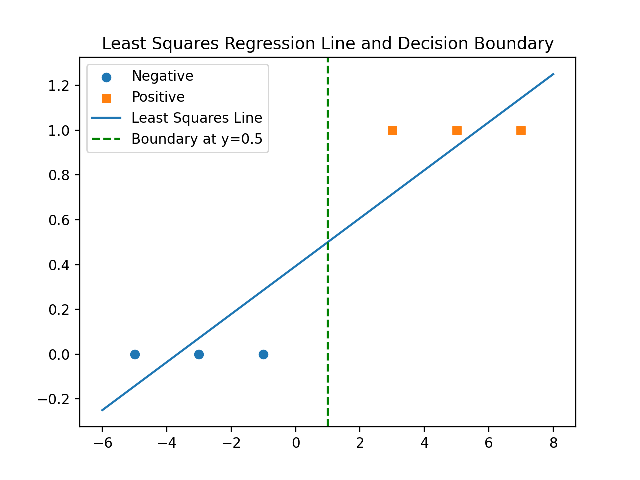
The least-squares line and the boundary it implies
On this toy set, both approaches land on nearly the same boundary. The interesting part is why: logistic regression squashes its output into a probability and is fairly robust to points far from the boundary, while linear regression fits a straight line through the labels themselves, which means far-away points can pull the fitted line, and therefore the boundary, in ways that have nothing to do with actual classification accuracy.
When accuracy lies to you.
Far more patients survive than die in this dataset, so a model that predicts "survives" for everyone can post a deceptively high accuracy while being clinically useless. To address this, I modified the logistic loss to weight positive and negative classes asymmetrically, penalizing mistakes on the minority class more heavily.
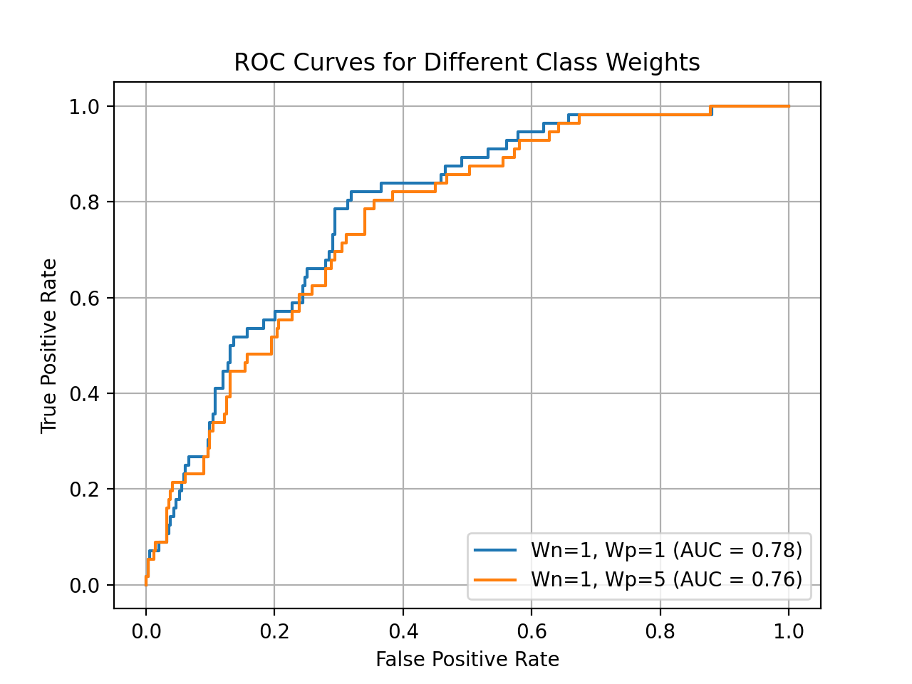
ROC curves for equal class weights versus a 5x weight on the positive (death) class
What heavier positive weights do
Raising the weight on positive examples pushes the model to prioritize correctly classifying patients who die, even at the cost of more false alarms. In practice this meant sensitivity jumped dramatically while specificity and precision dropped, a direct and expected tradeoff rather than a bug.
AUROC barely moved
Threshold-independent, ranking-based metrics like AUROC and average precision stayed nearly flat across class weights, while threshold-dependent metrics like accuracy, sensitivity, and specificity swung wildly. Class weighting mostly reshuffles where the decision threshold falls, not how well the model ranks patients by risk overall.
| Metric | Wn=1, Wp=1 | Wn=1, Wp=50 |
|---|---|---|
| Accuracy | 0.8575 | 0.2375 |
| Precision | 0.4167 | 0.1538 |
| F1-score | 0.1449 | 0.2667 |
| AUROC | 0.7832 | 0.7412 |
| Average Precision | 0.3586 | 0.3490 |
| Sensitivity | 0.0877 | 1.0000 |
| Specificity | 0.9798 | 0.1158 |
Weighting the positive class 50 times as heavily flips the classifier's behavior entirely: sensitivity jumps from 0.0877 to a perfect 1.0000, while specificity collapses from 0.9798 to 0.1158. Threshold-independent AUROC barely moves, from 0.7832 to 0.7412, confirming the model's underlying ranking of patients is largely unchanged.
An already-trained classifier with reasonable AUROC but poor sensitivity doesn't need retraining. Sweeping the decision threshold on its existing scores can often recover the sensitivity a class-weighted model would have given, without touching the model itself.
One number isn't enough.
A single test-set score can be a lucky or unlucky draw. Instead, I resampled the test set with replacement 1,000 times, recomputed every metric on each resample, and reported the median alongside the empirical 2.5th and 97.5th percentiles as a 95% confidence interval. This turns a point estimate into a real picture of how much the model's performance could plausibly vary.
Median over mean
Reporting the median of 1,000 bootstrap resamples, rather than the mean, keeps the summary robust to the occasional resample that happens to draw an unusually easy or hard subset of patients.
A confidence interval, not a checkmark
Two models with similar median AUROC can look identical until you see their confidence intervals. A narrower interval means the model's performance is more consistent across resamples of the same underlying population, which matters more than the point estimate alone.
Scaling up, and rebuilding the pipeline.
For a final challenge, I moved to a larger 10,000-patient training set and redesigned the baseline pipeline into a single scikit-learn Pipeline, so preprocessing would fold cleanly into cross-validation instead of leaking information from the full dataset into each fold.
Median imputation + missingness indicators
I switched from mean to median imputation for robustness to skewed lab values, and added a binary indicator column for every feature marking whether it was originally missing. In medical data, the fact that a test was never ordered can itself be predictive.
Standardization + balanced L1
Features were standardized to zero mean and unit variance before an L1-regularized logistic regression with balanced class weights, chosen after sweeping C and both penalty types for the best combined AUROC and F1.
Out-of-fold thresholding
Rather than picking a decision threshold on the same data the model was trained on, I used 5-fold cross-validated, out-of-fold decision scores to sweep 400 candidate thresholds and select the one that maximized F1 honestly, on predictions the model hadn't seen during that fold's training.
Refit, then hold out
Once the threshold was chosen out-of-fold, the pipeline was refit on the full training set and applied to a genuinely held-out set with no labels available to me, producing both binary predictions and continuous risk scores for submission.
("imputer", SimpleImputer(strategy="median", add_indicator=True)),
("scaler", StandardScaler()),
("clf", LogisticRegression(penalty="l1", C=0.05, class_weight="balanced",
solver="liblinear", fit_intercept=True, max_iter=5000)),
])
# out-of-fold decision scores, then threshold swept to maximize F1
oof_scores = cross_val_predict(pipe, X, y, cv=cv, method="decision_function")
best_f1, best_t = -1.0, 0.0
for t in ts:
f = f1_score(y_bin, (oof_scores >= t).astype(int))
if f > best_f1:
best_f1, best_t = f, t
Confusion matrix after refitting on the full training set at the out-of-fold threshold: 6,956 true negatives, 1,511 false positives, 547 false negatives, 986 true positives. The F1 held up after refitting, which is what confirmed the threshold actually generalized rather than overfitting to one split.
What it's built with.
The feature extraction, imputation, and normalization logic was written from scratch, with scikit-learn handling model fitting, cross-validation utilities, and the final pipeline composition.
What I took away.
Feature representation is half the model
Choosing to summarize each variable with its max, and deciding how to impute what's missing, shaped the final predictions just as much as which classifier I picked. Model selection got most of the attention going in, but data representation deserved just as much.
Regularization is a knob, not a fix
Watching the ℓ0-norm plot made L1 versus L2 tangible in a way the math alone hadn't. L1 doesn't just shrink weights, it actively decides which features get to matter at all, which is a very different kind of control than L2's uniform shrinkage.
Honest evaluation takes real discipline
Bootstrapping test performance and selecting decision thresholds out-of-fold both felt like extra steps at first. In practice they were the difference between a number I could trust and a number that just happened to look good once.